Press [ esc ] or close+
Getting Sporty


Client
Asia Sports Marketing
IndustrySports & Recreation
The Brief
To revamp the existing logo and to create a more modern identity for the brand.
The Creative Solution
Since the brand mainly deals with sports marketing, the need of the hour is to create an identity that is both dynamic & vibrant and stands out in this highly competitive market.
The Outcome
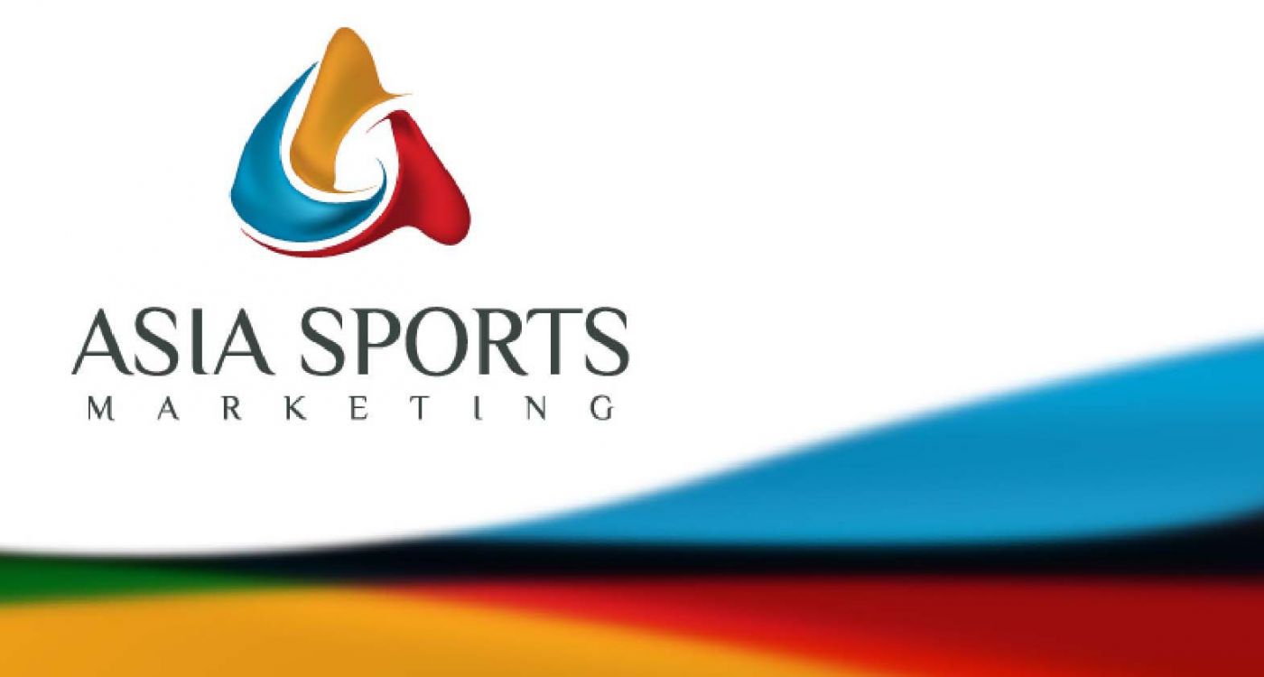
The new logo uses the colours yellow, blue and red to create a triangular formation that highlights the strong foundations of the company. The swishes that form the triangle give the logo a more fluid, dynamic appearance. The colours were also consciously chosen by the team – blue represents reliability, yellow represents energy and red represents vibrancy – perfectly defining the ideals of the brand.


